Wednesday, 20 November 2013

Final images

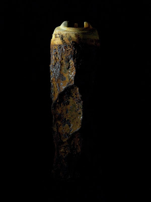
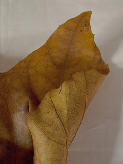
As this week is my crit i have chosen images to print and present in class. After talking to the class i have been given feedback on their favorite and mine to pick images we prefer. I have gone with images only on a black ground mainly due to the fact everyone loved the images on the black also the white but shouldn't print out both. 
I have chosen two images from each object so overall i have eight images. I printed them on A3 as i thought that was a reasonable size i thought A2 would be too big for the image i was producing but A4 would have been too small to see the detail so that's why i went with A3. 

I have been thinking of titles for my images but cant decide and i think i am going to use one or two words to talk about all the images as a whole. 
Titles 
  • Unwanted Objects
  • Forgotten
  • Left to rot
  • Decaying Hornsea
  • Deterioration 
I am going to name these sets of image
Loss Of Functional Activity. 

I like the fact it doesn't suggest that its decayed of died or where its from it just says its lost its use basically which i think is simple but it works. 


Martin Ouellette 

In my feedback session i got given this mans name to research as he takes images of decay and on a coloured back ground. When looking at the image he produced i was very fascinated and continued to read his description of his work and found out the images are paintings and i had no idea they are so detailed it also says he was inspired my macro photography of decaying objects found in urban landscapes. He paints images of warn out magazines, wires and rusty nails. 

I found this really fascinating on what he says about his work and i feel the same to what he says and that everything comes to an end and capturing it is an enjoyment of it dying.  Here is some information from this website  http://www.galerieyoun.com/galerie-youn-artists/martin-ouellette/ which talks about his work in detail. "These mass-produced items are used to serve a momentary purpose then left to decay in their natural surroundings. In this transitional state, in this moment somewhere between glory and gloom, I find a new world that is a part of every day life even though we rarely notice it. Only upon careful consideration, are there layers and layers of worlds existing within each other that unravel. Time and the cycle of life of these objects are what I find fascinating. I see the aesthetics of decay – a natural decay of the objects – as one aspect. Then there is the period of time and history materialized; time forms a unique trace of its trajectory, influenced by its surrounding environment and climate. At the same time, these objects are naturally evolving and slowly decaying to its death.

Here are a few of his paintings. 


I love the colours in the background of these images and its given me an idea to take more images of decaying objects but on a coloured background. I do think mine with a black and white background does create an depressing gloomy look to the death of the object but i think the color gives it a whole new perspective. 


Vantitas 
I was told to look up Vantias as it was a type of symbolic work associated with Still life. This type of work flourished in the Netherlands in the 17th century. The objects in the paintings always had a meaning for example books,maps and musical instruments suggests art and science. Jewelry, purses and coins show wealth. And a major object was a skull and this meant death along with a clock and a burning candle. Also a shell is a symbol of birth in the image.


Pretty much every painting features a skull a simple google search and every image that appears is a skull. The skull is always there as it is to remind the viewer of the certainty of death. Which in my opinion is interesting and looks appealing but a bit morbid i wouldn't want a painting of a skull in my house but i guess it was the era that it was popular to have that. 

I would like if i haven't already said this looking at next term when i return to the blog at looking at doing a still life theme but composing lots of objects to create an image as i haven't really done this as yet. I have only focused on one object at a time. 

Tuesday, 19 November 2013

Final set of images are of the pouch taken against the black background. In my opinion i think the black background makes the objects seem more dirty and look like its decayed but i think the white makes it seem pure and clean which is not what i want to create so i wouldn't use these images in my final. 


I used depth of field in most of my images of the pouch as i think it adds more depth and help the viewer only see what i wanted them too which on most images was the detail on the pouch and the decay.


More images
I have taken images of the leaf but on a white background as i again wanted to see what the overall image would look and if it had any difference. After comparing both sets of image i have found that i do prefer the black background i think its the colours of the leaf and the shadows and highlights work well with the black. 


More image 
Here are the image of the driftwood i took to see if it would work against the white background. But after looking at them i think as the object is lightly coloured it stands out more against the black. 


I love this image i find it so interesting simply because its different from the others as i have taken it on the side. But i particularly like the white space around the object usually i don't like it and been taught to not have too much white space but i do like the space around it a lot makes it look more pure and simple and adds more detail. 


More images 
I have taken more images of the following objects, the leaf, pouch, driftwood and aerosol can. Using a white background this time during my feedback my class love the images against the black but my also wanted to see if they had the same affect as the do with white background. 

I really like the image above, i think it does show more of the can then the black image but in all my images i think using a black background makes it more dramatic. But i like how the white background does make the image seem more pure and clean against the dirty rust can.